ELIF AYITER

The last project of the 2 semester long Project Studio class goes into a subject that at first glance is not directly related to branding. However like all major graphic design projects it still concerns itself with creating a system in which all parts (in this particular case the individual pages of a multi-page document) work together under one holistic matrix, while at the same time producing variations of this umbrella system on different pages that cover different topics which would need design flexibility in order to be laid out correctly.
In this project we will put together a paper print based, commercially sold or distributed life style magazine for which we will design a number of sample pages that will accomplish such a holistic and yet varied system: 7 double spread pages (and we will get into the contents of these pages in just a little while) and one A4 vertical sized cover.
These are the many printed magazines that are sold at newsstands, book shops, airports, train stations and many other places. Many of them, in fact most of them get published monthly, while there are also magazines - especially the kinds that deal with current affairs and politics - that get published on a weekly basis.
While most magazines cater to specialized audiences and / or interests, there are those that have a broader content. These are called life-style magazines and a very good example to them are in-flight magazines that airlines give out for free to their customers. However, life-style mags are not limited to airlines since many women's and men's magazines can actually also be defined as life-style magazines, although of course they are limited in this definition in that despite the fact that they cover a wide range of topics from health, to shopping, to travel and fashion; they still target only men or only women and not everyone.
The reason we will be doing a life-style magazine and not one that is more specialized in a topic or a demographic (even a broad one such as men or women) is that this type of mag gives us a very broad range of subjects that can be housed within a design system. In other words, learning how to create a design system for a publication that has a diverse range of topics will be a far more fulfilling educational experience for you. If you learn to pull this off, a more specialized mag will be much easier to do. And when learning something new, it is always better to learn what it is hardest, at least in my experience.
We could of course be designing a non-print medium mag, one that can be viewed on a tablet. However, my experience tells me that there are things to be learned in terms of layout when it comes to print based magazines that do not seem to come into play in the non-print medium since non-print media is far more template oriented than print media which allows for far more diverse layouts that vary from page to page.
Having said all this, let us now look at the content structure of a commercial magazine. Not just life-style, but all mags have similar structures when it comes to their content which is divided into departments (bölüm) and Features (konu) to which are added a cover and a contents (içindekiler) page.
Defining a commercial (sold or distributed) paper-printed magazine.


These are pages that repeat in every issue such as for example an astrology page, or a health page, or an events page. Movies, music, art. Any topic really as long as it repeats in every issue. The content will of course be different from issue to issue. So, as an example, a "beauty" page could talk about suntan lotions in one issue, and mascaras in the next issue. The thing is that in a department page any content is approached in a light way. Small, informative pieces of text, lots of images. In the three images above the first one is an example as to how these pages are constructed. As you can see there is relatively little text, only superficial information that it won't take long to read or to look at.
Department pages (Bölüm sayfaları)
The second and third images in the gallery above are examples of feature pages. These are pages that have content that will only be covered in this one current issue and will not repeat itself. But this is actually not the main difference: Feature page content is far more in-depth. The content is usually spread over multiple pages and very often there will be a special cover page with a beautiful photograph or some other fancy design stuff such as the one you see in the middle image above. The follow pages will have a lot of reading material. So, while you are only expected to spend a few minutes, maybe not even that long, on a department page, you are expected to spend quite a bit of time reading on a feature page, if it is a topic that interests you.
In addition to these 2 main categories a magazine will have a cover of course, and also a contents page. These we will be doing once the actual content pages are completed. They will still be under the same design system, but since they are isolated pages they will also need additional special treatment which is why we are leaving their design process to the very end of the project.
Feature pages (Konu sayfaları)
The challenge in designing for such a diverse content that incorporates 2 different ways of consumption (one fast and superficial, the other lengthy and in-depth) is in creating a holistic and yet flexible system that will cover the needs of both of these types of pages, as well as other areas of the publication such as the cover and the contents page.
Creating a flexible Holistic System
Step 1 _ Understanding Modularity
Systems that are flexible enough to allow for different layouts on different pages (which is what we need when it comes to magazine design) are based upon a principle of modularity in which the components of a systems will work in combination as well as separately.
A very good way of understanding this is to look at shelving or kitchen / wardrobe systems that are manufactured by companies such as IKEA:


As you can see, a modular system allows you to create a lot of variations since the units of the system all have the same vertical measurement or multiples of it. So it is "X" and multiples of "X" such as "2X", "3X" and so on. You can also see that while the vertical measurement is fixed the horizontal shelves have more more flexibility. And that is exactly how magazine layouts work in graphic design also. The vertical spaces of the wardrobe system becomes a column, the vertical separating walls between the spaces become gutters. And then there are few additions such as margins, the central gutter and so on, into which we will go in order.
Step 2 _ Understanding Columns, Gutters and Margins
The way in which I want to show you this at first is by looking at the magazine that Yeliz Fırat designed in this class 3 years ago. You will see the layout as it is, but then I have also added an overlay that shows you the columns, the column gutters, the page gutter and the margins in different colors which you can identify through this legend:

Page Margins: These are the spaces that we leave on either side of the page as well as the top and bottom.
Page gutter: This is the empty space that is left in the middle page since there will be a fold here and we will not be able to read the type or see details of pictures that fall into this central area. So, naturally this space is left empty.
Column gutters: We need small spaces between the columns so that the texts inside the columns don't touch each other.
The column. This is the central, most important element that corresponds to the wardrobe space in an IKEA shelving system. In short, it is where we put stuff. The content is designed around this vertical system. Body texts always stay within it. Other elements such as headlines, sub-heads, images, spots, etc can go outside of these spaces. But more about all that later.


What you see when you look at these layouts is that each is quite different, and at the same time we can immediately tell that they belong to the same publication.
The reason for this is that Yeliz has a matrix of columns, gutters and margins which are the same on every page, that is what makes us aware that these pages belong together. They are all manifestations of the same system, which is this vertical matrix. However, they also look different from one another since on every page Yeliz has utilized this matrix for different placements and also for different values of "negative space" (more about this later). And yet, while she did this, moved things into different positions on the page what you need to look at very carefully is the placement of the "body text" (which is the name we give to the small long texts that often consist of more than one paragraph). While other elements such as headlines, sub-heads, images, and so on, can go outside of the column matrix, the body text always stays inside the column areas. And that is the trick. That makes each page part of the bigger system.
Step 3 _ Understanding the Stylesheet
While this underlying vertical column matrix is crucial - without it we simply would not be able to create the system, it is not enough. What we also need is a stylesheet of elements that are consistent throughout the publication. When we put together such a stylesheet we try to come up with typographic and visual material that will have a strong consistency, but at the same will be flexible enough to be able to work with from page to page.
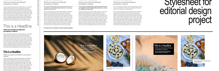
In order to explain just exactly what is meant by this idea of a "stylesheeet" I will use one of the past years' student projects as a visual guid. This is the magazine designed by Leyla Mutlu, also 3 years ago and her spreads are very good examples when it comes to putting together a stylesheet that works really well. Below the gallery you will find detailed explanations on her choices which will make it clearer as to how you should be making your own choices.


The Typographic elements: You will probably already have a pretty good idea from your branding project about the importance of a consistent set of typefaces that run throughout a project. Editorial design is no different in this regard. (In fact, no graphic design project is different). So, what you will need to do is to pick a portfolio of typefaces that work well together and that will be used on every page. In editorial design there is almost always a typographic hierarchy which means that quite a few different typographic elements will need to be considered:
-
The headline: This is the most prominent text on the page, it is what we see first. It is usually big, however doesn't always need to be large. What is important is its placement in relation to the elements that are further down hierarchically. Leyla has chosen a sans serif font that looks a lot like Futura, but is a contemporary adaptation of that rounded letter sans-serif style. However, it isn't only the choice of font, it is also how she uses it, which is always all capitals and in the same font weight which appears to be a 'medium' or a 'semi-bold' weight.
-
The subheads: These are the same font as the headline, but are used in a much smaller point size and also in a different font weight which appears to be a 'regular' or a 'light' weight.
-
Introductory paragraph: This is the text that is the start of the body text which is written in a larger point size and is usually placed at a transition point between the body text and the headline or subhead. Leyla has introductory paragraphs on almost all of her pages but you can specifically look at the Chiara Ferragni page, the Santorini page or the Scarlet Sails page to see them very clearly. For these she has chosen an italic serif font. This makes a very nice contrast between the sans serif headline and also ties in very nicely with the body text since it is the italic version of the body text font.
-
The spots: Spots are little bits of text that is usually taken out of the body text and is highlighted. To give examples, the quotes that Leyla has put in the Chiara Ferragni page and the Post follow page inside the photo of Meryl Streep are spots. For these Leyla has continued using the serif font she is using for the introductory paragraph and the body text. But she is making a variation by using it non-italic and quite large so that there is a nice differentiation between these 3 different typographic elements - that is, to repeat, the introductory text, the spot and the body text.
-
The captions: These are the things that explain what the photos are, so these text pieces belong to the photos and are usually placed quite close to them. Leyla has used the same serif font that she has used for the body text and she has also kept the same point size. However, because these pieces of text are placed very close to the photos there is no confusion, we know right away what they are.
-
The body text: These are the long pieces of text that we are meant to read at length and at small point sizes (these can vary from 8 to 11 points and usually do not go bigger than 11 points with most typefaces), so the really important point with these is that they should be made out of a font that is easy to read. Serif fonts are much easier to read than sans serif fonts because of their structures that gives them little shoes. These shoes form an automatic baseline between the letters that makes it very easy for our eyes to slide along the lines. Normal width sans-serif and grotesque are usually very hard to read because there is a lot of space at the bottom between the letters. An exception to this narrow sans-serif or grotesque fonts such as Arial Narrow for example. These are quite easy to read also when it comes to long pieces of texts. However, the important thing, if you want to pick a narrow (or condensed) sans serif font for body text is to pick one that is not too condensed. The font I am using on this page is Barlow semi condensed which is just the right narrowness - narrow but not squished. And there are plenty of semi condensed fonts out there to choose from.
So, to summarize what Leyla did with her typographic elements: She picked 2 fonts with families (different weights). One is the rounded, Futura-like sans serif which she used in all caps on her headlines and subheads. The second is a serif font (my guess is Cormorant but I cannot be sure) which she used for everything else with different variations. She seems to have chosen wisely since 2 font families is usually the most sensible way to go about this, although there are many cases where really nice mags are designed with only one font family. And there are also many mags that have 3 font families in their stylesheets.
The video above was made for the Web Design Class. It is a basic web (not graphic design!) typographic design tutorial. That said, I think that there is stuff in there that will benefit you as well. We will of course be looking at all this in much greater detail during the classes, however I would still advise you to watch this since it does give you a good basic overview of setting up text hierarchies.
_______________________________________________
Now let us continue to the other elements of a stylesheet. In order to get a very clear understanding of this I am going to go over this with more examples from previous years' student work. Leyla and Yeliz will continue to be with us but now we also have work by Aleyna Tezer and Irmak Pehlivan, again from the class of 2019, 3 years ago.


The Visual Elements: Typography is always the first place where we start in graphic design, however it hardly ever ends with typography. Equally important are the visual elements when it comes to a stylesheet in order to create a continuous system that is capable of transforming audial content (the words that conveyed in the texts) to visuality. For this we need visual material.
-
The photographs: It isn't just a case of putting an image on a page, there are many different ways of using photographic material. So, let us look at the ways in which your friends from previous years did it:
-
In the spreads called "Scarlett Festival" and "Akvaryum" Leyla and Aleyna used images as full backgrounds. This is something that is especially used for cover pages of magazine feature articles. (Konu sayfası) When you do this what is important is to find a photo that has enough empty space to place text on it. The text you put on the image should be fully legible of course. So, you really do need to make sure that the image you want to use as a full background will fit this requirement.
-
Photographs can be used as straight rectangular boxes of course, which is in fact the most common way of using them. In the best examples the designer will probably crop the original photo to format that better fits the layout or that focuses on part of the image. I am not going to point out specific layouts in the gallery above for these, many of them have these which is to be expected since this really is the most common usage
-
A fancy way to use photos is to crop them in a way that creates non-rectangular boxes. In the "Etkinlikler" page by Irmak Pehlivan you can see that the photos have been cropped into trapezoids or other shapes. This way of displaying images is ambitious and it may get quite difficult to do this for a continuous system such as a magazine since a crop like this may work on one page but not on another. But, by all means, no harm in experimenting. Play around!
-
A really good way of bringing movement to a design system is by silhouetting some of the visual material the way in which Yeliz has done on her "Mayıs" page. This can be especially good on department pages (bölüm sayfası) that contain shopping tips or display new products since on such pages you will need to show a lot of visual stuff and silhouettes will give you more negative space.
-
And of course, even needless to say, combinations of these different types of photo material usages which is in fact what you should do. That is of course what works best, doesn't get boring. What you do need to do however is to decide on a "usage strategy" and keep to that throughout.
-
-
Shapes _ lines, boxes, dropouts, background elements, and even typography as shape: When you look at the spreads in the gallery above you will see that there is plenty of stuff aside from text and photographs. In graphic design we need shapes in order to create hierarchies, in order to separate things from one another and also as directional axes or pointers that let the viewer's eyes go from area to area within the layout. Shapes are also very good contributors to a visual system.
The thing to always bear in mind however is that shapes need a function. So, as an example, if a line does not separate two distinct areas of a layout, or 2 distinct types of content, if it doesn't contribute to a contentual hierarchy, if it is put there just because you felt like it, because it "looks good" it probably won't work. And it probably won't look very good either since it will be a superfluous element. That said, almost all layouts have distinct areas and content separations, and hierarchies, so almost all layouts will benefit from the placement of shapes that emphasize these.
-
Lines: In the layouts above lines of various thicknesses are used in almost all of them but I am going going to go into a detail explanation in only one usage, which is Irmak Pehlivan's work. Irmak uses them as separators between different content in both the "Etkinlikler" page and her "İçindekiler" page. And she also uses them as diagonals which give them a distinctiveness as a design elements. They aren't just lines they have a visual identity - they are diagonals. Since she uses these diagonal lines consistently on all her pages their distinctiveness also adds to the system. They become objects of continuity within her system that hold things together from page to page.
In most of the other usages above the lines are used as separators between text elements that emphasize textual hierarchies. So, we see lines between headline and subhead in Leyla's work ("Scarlett Sails" and "Jumbleberry"), or as a separator between the headline and subhead group and the body text in the continue page of "Akvaryum" which was made by Aleyna Tezer.
-
Boxes: We see that Yeliz in "Mayıs" and "Renklerin önemi" used boxes in order to embed her subheads into them. Embedding certain text elements inside boxes can be a very good strategy since it can work both as a hierarchical element, and a separator. So, what Yeliz accomplished here with the boxes is this: Her actual headlines are big. And also they have very distinct placements which make them stand apart (placements is a topic that we will go into separately later). But while her headlines are the first object of her hierarchy (in other words they are what we see first when look at the page) she also wanted to emphasize her subheads - of which she has quite a few. So, instead of just placing them straight on the white background she boxed them into thick black lines. So, while we see the headline first, our attention is drawn to the subheads afterwards.
-
Dropout Boxes: These are boxes that are placed on images or other shapes in such a way that they create a box within other visual material into which you can then put text, especially captions but other text also. We see them above in Leyla's "Jumbleberry" page on the left side where she placed a white dropout box on top the photo and placed her text inside it. Yeliz does it with the word "Tatlımsı" as well as the caption text which she places in dropout boxes over the coffee cup on the "Mayıs" page. And Aleyna does it on her "Fast Food" page where she places the word "food" inside a drop out box over the photograph.
These dropout boxes can also of course be semi transparent if you want to still show a bit of the image that they are placed on. However, be careful that the opacity is enough to make the text placed inside them fully legible.
-
Background shapes: You can also use background shapes, or dividing the pages into color fields, very effectively - both in terms of separating different content and creating hierarchies. When such a usage is spread across all pages you also end up getting very effective systems. On this page I try to use examples of my own students' work as much as possible. But it appears that in past years none of them have used background shapes. So, here are a few links for you to check out where this has been done:
https://tinyurl.com/w37xet9
https://i.pinimg.com/564x/72/29/57/72295787e7c2f6efb8434bbac7775c46.jpg
https://i.pinimg.com/564x/17/1e/34/171e340a5236a51945b6efc006d1e100.jpg
https://i.pinimg.com/564x/3c/4c/bf/3c4cbf9f959e02e9a89da45570b609ec.jpg
https://i.pinimg.com/564x/d6/42/04/d642040d598f6029d21716c4a1912d40.jpg
-
Illustrations and clipart: The visual material used in magazine layouts does not have to consist solely of geometric shapes such as lines and boxes. Many very successful mags also use vector illustrations and clip art alongside (and sometimes even insted of) photographs. Here are some examples I found online:
https://www.instagram.com/p/BoL_KY-l3QM/
https://www.behance.net/gallery/40798269/Editorial-Collection-2
https://www.behance.net/gallery/6537025/CHARAKTERY-EDITORIAL-ILLUSTRATION
https://www.instagram.com/p/Bat2jY_BP8h/?taken-by=jacobsteadillustration
https://i.pinimg.com/564x/90/55/17/905517e96a4427d77c10f501ae6af959.jpg
If you want to do this, put vector illustrations in your design, go for it. However, please bear in mind what I always say: Do not spend time doing it yourself. It is more than likely that you will find the components of what you are looking for on resource sites such as vecteezy and freepik. All you need to do is take the parts and combine them into "your thing". This is not an illustration class. Our objective here is not to create original illustrations, it is learning to create editorial design systems. So, what we are doing is hard enough as it without added shenanigans like that.
-
Using typography as shape elements: In the gallery above the one who did this to good effect is Aleyna Tezer with her layouts called "Fast Food" and "Alexa Chung". And we can also see such typography as shape element usage in the contents page of Irmak Pehlivan where the numbers 7, 10-11, and 20-21 have been used not only as numbers but shapes. You will see this type of usage of numbers as shape elements on many contents pages. The idea with this is not make random numbers larger simply because it looks nice, instead you emphasize the numbers in order to direct attention to the feature pages of that particular issue. So, working with numbers on a contents is something that addresses a hierarchical need.
There are tons of examples of typographic usage for shape creation if you look online, in places such as pinterest. Such projects have also come out of previous years' project studio classes such as the magazine designed by Meha Shahid a few years ago that I am showing below. What Meha did was use headlines in very large point sizes which turned them from being simply text into shape fields. In a few of her spreads, such as the "Eating Healthy" spread she played with the typographic arrangement.
-

Note: While this strategy of "playing with type" can have good results there is rather limited application for it in a normal, commercially based magazine. It tends to work better in specialized design mags, especially those geared toward typography. Which doesn't mean that it cannot be used in commercial design - Meha has done a pretty decent job of it. That said, here are few more examples of it:
https://i.pinimg.com/564x/a0/6a/8c/a06a8ca7cf90f5c5046f248d191d23f6.jpg
https://i.pinimg.com/564x/f4/3a/34/f43a34d200dd33f3b81f2da624c1e35b.jpg
There are number of tutorial videos that I made for the web design class where I talk about bringing together typography and images. Although these do not specifically address the needs of an editorial layout they will nevertheless be helpful. See them here: https://wixtrix.blogspot.com/2021/03/typography.html
Step 4 _ Configuring a layout


So far we have spoken about the individual components that go into and make up a layout. We now have to look at how we bring these together. And here we will first speak about some concepts that we have talked about throughout this year. These apply to every imaginable graphic design project, of course, but become especially relevant in editorial design.
-
Alignment: I am not going to go on about this at any great length now since we have been talking about this a lot, all the way back from the start of last semester. You will be doing your project in InDesign which will calculate the columns and give you the grid while you are setting up the project. It is quite needless to say how important vertical alignment is when it comes to creating a system that is based upon columns which are vertical objects.
What is important to consider in addition to this default vertical alignment is horizontal alignment. It is a good idea to have certain elements on the page also align on a horizontal axis. Now, this is something that will change from page to page. In other words, each page spread can have its own horizontal alignment axis, however you are very unlikely to be able to repeat this on another page since the contents of the different pages will be different. One page will have more text, one less. One page will have lots of images, the other won't.
The first image in the gallery above is from a project by Buse Haberal and it is an example to horizontal alignment in which the cropped bottom of the chimpanzee image on the left aligns with the body text on the right hand page.
-
Clustering: Again, this is something we have previously talked about in classes but it is something that becomes very important in layout design. And it is also something that works together with space, which is the next bullet point. So, you should really read these two together. The way we humans best perceive visual material is when things that belong together are placed near one another, and we understand what we see even better if these things that are placed close to one another also group themselves around a central object that is made more prominent through it central placement. When all the elements on a page are more or less the same size and are placed in equal distances and it becomes very hard for us to figure out what to look at first. We lose direction and we lose interest very quickly. In order for clusterings to work best ideally we also need empty space around them, especially if there is more than one cluster on a page. This empty space we call negative and more about that in a minute.
Clusterings exist in almost all of the examples that I am giving you on this page. In fact, looking at them again now I cannot find even one where clusters have not been used - more so in some than others, but always there. Which is to be expected, of course. You will see in all of them that there are groupings of text pieces, together with images, and sometimes shapes. And you will see that in all of them there is enough empty space left between these clusters to allow them to become visible as distinct visual entities.
For the purposes of this section I have added the "Japan" page designed by Mine Gündüz 2 years ago which is the second image in the gallery. She has 2 clusters on this double page, one on the left in which the headline has been placed inside the image with a dropout box. Mine has done something that is quite interesting here: She has created a subhead out of a spot which is the quote on the right of the image. And then we have the starting paragraph of the body text below the picture as well. This first cluster is separated by quite a bit of empty space that runs across the page gutter from the second cluster where the rest of the body text is placed underneath a photograph. This double clustering, both of which are made out of different sized pieces that are placed close to each other around an image, divides the content into two parts which makes it much easier for our eyes to perceive it - and also to want to read it. Had everything been written as one long piece of body text with a headline above it and two equal sized pictures next to it we would probably be far less likely to become interested in what is here.
-
Space: In order for clustering to work really well, clusters will need to be separated from one another with empty space left in-between them. Again, you will see that there is quite a bit of empty on almost all, if not indeed all, examples that I am giving on this page. Emir Darman's "Nike" page however makes such dramatic usage of empty space (it could be even be said that his entire design is built around empty space) that I decided to make it the special example for a discussion of space in design by putting it in the gallery above.
In the design fields we call empty space "negative space". What this means is that the space is empty of informational content. Not that it is actually completely empty (as is the case with Emir's layout) but that it is empty of information. So, in order to understand this idea of "empty of information" space let us look at the 4th layout in the gallery which is by Dilara Doğan and is called "Büşra Develi". Here Dilara is using a full page photograph as a background. Yes, the photo is full page, we do not see any of the actual white page background. But the thing is that quite a bit of the photo is actually negative space because it is empty of information. In fact almost the whole right hand side of this photo is "empty". Yes, we sort of see a curtain. Yes, we sort of see the back of the sofa. And yes, we see that she is sitting in a pink room. These, do not give us any information when looked at by themselves however. Unless we have the portrait on the left side that puts everything in context what we see on the right hand side would be quite meaningless. It would not hold any information. And that is what negative space is. Again, it is space that is empty of information. Not space that is actually really empty. Space that contains information on the other hand (such as text obviously, but also clearly recognizable, meaningful visual material - such as the part that is Büşra Hanım's portrait in the full picture above, or Emir's sneakers) is called positive space.
Now, the trick to good design is very often in how much negative space you actually have available to you. Which will, of course, depend on the amount of content that you have to put on a page. On a website it could be said that this is up to you - you can make your pages as long as you like and add plenty of space in between clusters of content. Or you can divide content into sub-pages. This is theoretically correct however in practicality it hardly ever works that way since the longer a page gets the less likely people are to scroll down and too many clicks are considered to be a bad thing on a website. But, theoretically, let us say that this is correct for online design. That you can have as much negative space as you want.
This freedom disappears completely when you get to the print medium where there is such a thing as the price of paper. The less paper a designer the more his bosses will like him or her. So, in the real world out there, when you start to design print medium brochures, catalogs, reports and indeed magazines, there will be a shortage of negative space. However, since you are not yet out in the real world, as students you are free to use as much negative space as you want. And the unvarying motto here is - the more the better. If you can get a page to be 50 negative / 50 positive you are in OK shape. Not great, but OK. If you can get this ratio to 60 negative / 40 positive much better. And if you can get it to 70 / 30 you are basically flying like Emir is doing above.
So, do not try to cram stuff into your pages. Give them space to breathe, for clusters to be able to separate so that things become clearly perceptible to the viewer. Always remember, the more negative space you have the more your positive space gets accentuated. We need the "S" between the sound to hear the music. And very much the same principle applies here as well.
-
Hierarchy: When we talk about hierarchies in editorial design we mainly talk about the text, and images become a secondary element, almost an aid to that.
There are several ways of achieving a hierarchy on a page. One is to do what Zuhal Uz did, which is to arrange the text elements in the order in which they are meant to be read which you can see in the 4th image in the gallery above called "Aletli Dalış": It is a very good example of setting up a textual hierarchy on a page in which headline, subhead and body text are arranged one below the other in a good cluster that is framed by the 2 images. The caption, which is the last element of the hierarchy is then placed to the side which gives it a distinctness through separation: It belongs to the hierarchy and yet it is also distinct from it.
But things do not have to be arranged one below the other in a reading order to achieve hierarchy. There are other ways of doing it, in which clusters, placements and negative space become very important. And equally important in these hierarchies are typographic weights and usage of color and grey tones. A good example to these is Fatma Betül Avcı's contents page of the magazine called "Kümülüs" which is the 6th image in this gallery. This is a very complex page that holds several sub-hierarchies and still works. So, let us look at what she did:
She placed the name of the magazine "kümülüs" at the vertical center of the page. The central part of a page when you look at it vertically is always the most prominent area of the page. So, the word "kümülüs" although it is much smaller than the big "içindekiler" at the top gains hierarchical advantage because of its placement. So, the placement of an element (as well as the placement of what is around it) is the most important part of establishing hierarchy. In addition that the word "kümülüs" is also written in a bold typeface which also increases its prominence. however, if you look at the words "Anouar Brahem" you can see that these are written in the same bold weight. And yet we see "kümülüs" first and the "Anouar Brahem" second. Another reason that we see "kümülüs" first is also the fact that a lot of other elements are grouped around it, like children hanging on to a parent almost. This central position where other elements show dependency on the central element is yet another very important tactic to achieve hierarchy. The picture hugs it from above, the contents list from below. And then, in order, once we see that "kümülüs" is number 1 we go to the other elements. Here, since it is very largely written, and also has a color (a very instance of colored text actually working) we can see that "içindekiler" is second and then the rest follow. And this rest has sub-hierarchies made out of clusters: The two features "Oleg Dou" and "Budapeşte oteli" with their numbers are one cluster, the editor's letter is adjacent to that and both of these as well as "Anouar Brahem" and its number surround an image which then becomes the "anchor" of this cluster.
So, to sum up - for hierarchies, placement first, clustering around the number 1 second. And you may need to create additional clusters that have anchors that hold things together as well.
Step 5 _ Deciding on a style


Now that you have gotten an overview of what a commercial magazine is all about, what sort of content it has, how we need to create a holistic system to accommodate this diverse content, what the individual components of such system are, you are ready to start thinking about your own work. This will involve a decision which you will make now - the design style:
Will the style of your magazine be classical? Will it be elegant? Or casual? Will it be minimalist? Will it be "clean"? Or will it be complex? Will it be highly structured or loose? In the gallery above I have put examples where some of these styles have been implemented. Let us look at them:
Zuhal's mag, of which I am showing the "incirli salata" page here is a clean, minimalist design. It can also be considered to be a classical approach since in her pages she maintains a textual hierarchy that works in order. You can see the full magazine here. The same things can also be said of Buse Haberal's project of which I am showing the "ahududu zevki" page here - clean, minimalist and contemporary. Lots of clean negative space, mostly rectangular photography usage, adherance to text hierarchy in which the order is vertical from top to bottom. You can see the full magazine here.
And then we have Leyla's "Santorini" page which shows us that her project can be placed under the category of clean and classical. This classical look is because we have less of a minimalist approach in her case and therefore look more like what we would expect a commercial magazine to look like: The pages have less negative space, but because of a very well thought out placement and clustering strategy things do not look cramped. You can view her full magazine here.
We find an altogether different approach to a design style when we come to Aleyna Tezer, Yeliz Fırat and Irmak Pehlivan. The pages I am showing of their work are "fast food" by Aleyna, Irmak's content page and Yeliz's architecture page; and you can click on their names to see the full mags that they designed in order to get a better understanding as to how the styles that they decided upon were spread across the pages. Their styles are complex and unstructured, experimental. While they keep the body texts within the columns in order to preserve the system, a lot of other things go outside. The text hierarchy is not in order but is also spread across the page and hierarchy is achieved not by ordered reading but through directional axes that they achieve through placement.
Putting together a design style involves different types of decisions:
-
The first of these is space usage. More negative space will give you a more minimalist, contemporary looking design style, less of it will give you something that is more standard and classical.
-
The second decision involves text hierarchy: Ordered or spread out? The first will give you a more classical structured feel, spread out will give you a more deconstructed, experimental feel.
-
The third decision brings us to something very important: Element selection.
-
The fonts you choose for headline, subhead and spots (not body text, only the bigger typography on your page is important here!) will be one of the top things that determine your design style.
-
Grotesque fonts such as Arial, Helvetica, Roboto will be neutral. These can be used within any design strategy. They will look appropriate in a classical design such as Leyla's, but they will look equally appropriate in more experimental approaches. The reason for this is that grotesque fonts are the penultimate generic font that suits every design need.
-
Serif fonts will work very well in an elegant, classical style. (Note: Stay away from the ones that have small families, you will need the weights - and especially the lighter weights - to make your design work. The ones to go with should be the more recent fonts such as Cormorant, Taviraj, etc. Here is a link on google fonts of the ones with 9+ weights.)
-
Sans serif fonts (not grotesque) will work very well in contemporary designs, especially those that aim for a more casual, loose look.
-
-
Photography usage. Whether you use your photographs as rectangular boxes, as other shapes or as silhouettes is also important. Rectangular boxes will fit any design style and they are likely to be in design style, either by themselves, or together with silhouettes and so on. Silhouettes and shape cropped photographs will add to the design impact of loose, unstructured, experimental design style on feature pages (konu sayfaları). When it comes to department pages (bölüm sayfaları) you will see silhouettes in almost all mags since department pages will usually have more photographs. Therefore, in order to lessen space usage designers will prefer to silhouette a lot of images rather than using them as boxes with backgrounds that take up space.
But it isn't just the shapes of the photographs that you need to think about it is also the photographic style. Do you want to go with a brightly colored photo style? Black and white? Soft tones? High contrast? Low contrast? Manipulated? Raw? Colorized? Light? Dark? And especially a combination since the content of the mag is diverse so only one photographic style will be too restrictive. You will need flexibility, so you will not want to tie yourself down too much. On the other hand, you do not want to be too all over the place either, so make a selection. See what fits together, which combinations work best visually.
-
Shape usage. Again, the way you use shapes and background colors is part of your design style. Not much more to say about this specifically, since it is fairly self-evident. Will you use lines? Boxes? Will you embed certain text elements inside these boxes? If so, which ones? Will you use background shapes and color fields?
-
Colors: A further consideration directly related to shapes is color. Will your shapes be colored? If so, what is the color scheme going to be? Bright colors? Warm colors? Pastels? Saturated? Primary colors? And what are the color combinations going to be? Just as you did during your branding project I am going to advise you to go the paletton color scheme designer and decide there rather than put together colors out of your head.
As you have already heard me say repeatedly, using colored text is not a good idea in general. However, there can be exceptions to this, as we have already seen with Fatma Betül Avcı's contents page above. If you want to use color in your headlines or subheads (definitely no-no when it comes to body text btw) you are going to have to convince me (just like Betül had to back then), but for now I am not ruling it out. If you want to do this, the time to decide on it is as you are assembling the components of a design style. And if you are thinking of doing this - this is the motto to bear in mind: "Colored text is like red shoes. The whole outfit has to be adjusted to it."
-
A Holistic Design style: Above I have put a single image that shows the entire magazine designed by Deniz Uncular several years ago. This is a very good example on how a design style (space usage, typography, the background pattern that is on all of the feature pages - careful: not the departments - only the features!, the image usage is spread across an entire mag. This is what you will be doing also. So, start thinking about this.
How to put together a design style: The best way to do this is to create a moodboard like you can see in the example below. Click on it to view the whole thing on google drive:
Essentially a moodboard is a scrap sheet on which you place bits and pieces such as fonts, images, shapes close to each other to test if they work together or not. When you come up with good combinations you can save those, and you can also of course "design" the moodboard so that it ends up being a good looking design object in and of itself, which is in fact what the designers of some of the images that I have linked above have done.
You can make a moodboard on any software that allows you to use bitmap material. You can make it in Illustrator or Photoshop. There are also moodboard makers online, such as Canva and invision. I do not recommend them for a single but very good reason: They do not allow you to import your own fonts. Which effectively makes them useless.
-
So, go to your preferred software now. Start a big sized new document if you are in photoshop (although you can always increase the size as you go along). In Illustrator size is not an issue of course, since it is vector based.
-
Start by looking at fonts. Download a whole bunch of them and start trying out combinations. As many as you can.
-
Use either a serif or a narrow sans serif font for the body text as well as the captions and remember the body text should be between 8 and 12 points.
-
Decide which fonts, weights, and text sizes work best for headlines, subheads. Try many different combinations among the fonts themselves.
-
Then try these font combinations with photos and shapes. Go to one of the high res photo sites and download a bunch of images. Place them next to the fonts. See what works.
-
Try out shape relationships. Do not put everything in rows like soldiers. Try out text/visual combinations or text/text combinations as clusters with negative space between them.
-
Put the some of the text on top of the photos that have backgrounds suitable for that. See how it works.
-
Try different formatted photos. Squares, rectangles, portraits, landscapes. Full backgrounds and silhouettes. Place the different formats side by side. Drag the fonts next to them. See what works.
-
Add shapes.
-
Add backgrounds - photos or shapes, and provided they are subtle enough even patterns the way Deniz has them in her mag..
-
Try every combination. I know there are a lot of them, this is something that has a lot of variables, but do not get lazy, try them out.
-
Crop the parts of the combinations that you like and save them as separate documents.
-
Start a new document: Take the cropped pieces that you liked before and drag them into this new document. Do this until you come up with a final full moodboard that shows everything together.
-
Take the extra step and actually "design" this moodboard so that it can go in your portfolio.
Step 6 _ Preliminary Exercises


-
Start a new document in InDesign, exactly as I am showing you in the first picture above. This is all you need for now, all the other adjustments will come later. A4, 3 pages, and you start from the 2nd. Facing pages, 6 columns.
-
The document will look like the second picture.
-
You will see 6 columns on every page, however you actually only have 3 which are each subdivided into two. This is to give you more flexibility when you put the elements down on the page. This is what I mean by "irregular columns" in the third picture.
-
Make a big long Turkish lorem ipsum text by going to this page: https://www.nedirnedemek.com/araclar/turkce-lorem-ipsum
-
Copy paste this text into a text box, then make more text boxes and make the long text flow from one into the other. If you do not know how to do this there is a very short tutorial inside InDesign called "flow text between frames". We will format the text later, don't worry about that for now. I am making you put text instead of a grey box just so that you understand the logic of columns, how you always need gutters between them. The actual text will make you see that very clearly, grey boxes may confuse you. This is the only reason why we have text here instead of just boxes.
-
Add boxes. Make the ones that are for photos medium grey. Make the ones that are for the headline, the subhead and the intro paragraph dark grey. Also make them roughly the height of what you would expect these to be if they were text, and not boxes.
-
Now start moving everything around.
-
The body text stays inside the columns. Be careful where they start and end vertically. Lots of lines on the page, so don't get confused. Everything else can move freely, but as a general rule it is usually better to try to align things to at least the irregular columns.
-
When you are happy with a combination take a screenshot. Save as. Keep moving. Take another one. Save as. Keep moving.
-
Change the sizes of the picture boxes. Make some of the pictures boxes really large. Put the text boxes, and even the body texts inside them. Overlap picture boxes. Overlap text and picture boxes. Try some really large headline boxes. See if you can fit them on the page in an interesting way that still leaves enough space. Experiment.
-
Change the sizes of the headline, subhead, etc.
-
Make at least 20 variations like you can see in the pictures below. Except... I got these from a layout tutorial. They are very good examples on how to make variations except that most of them are very full pages. do not try to replicate that part. Yours should have more negative space than these. Remember, the more negative space the better.


Step 7 _ The Contents page and the Cover
While we have discussed the department and feature pages of a magazine at the very start of this tutorial, I have deliberately left the contents page an the cover to the end since we can put these together only after we complete the inside design of the magazine. While these have to be designed within the same design system (same stylistic elements, same column structure, etc) they are discrete entities that have characteristics of their own. So, there are additional guidelines we need to consider (especially when it comes to the cover), so we will go into these in some detail at the end here.
The Contents page


In the gallery above you see contents pages that have been designed by students in previous years. A contents page is placed at the start of the magazine and is an index page where the reader can get an overview of the entire issue that they are holding in their hands with a brief glance. It contains the titles of both the features and the departments, together with their page numbers, so that you can skip straight to that page of the mag if you want to. In short, this is a list that helps you navigate the contents of the issue. Things that are more important will have more prominence in the listing. They will get highlighted with photographs or larger numbers, or both. Usually what is more important are the features, but this is not an ironclad rule. Sometimes a department can also be highlighted.
-
The design elements that are used throughout the rest of the system (fonts, shapes, lines, photography usage, other visual material) get carried over to the contents page as well.
-
The column system used in all the other pages gets applied on this page also.
-
In terms of layout content pages are closer to department pages - they hold more images, more visual elements.
-
The typography of these pages is more variegated. The lists are usually structured out of different font weights. And the font sizes can also change more - especially when it comes to numbers.
-
Finally, a contents page can also hold the logo of the magazine, which we are seeing in some examples in the gallery above. "Yelkovan" by Yaprak Müldür, "narenci" by Dilara Doğan, "Eklektik" by Aleyna Tezer, "İris" by Mine Gündüz are all contents pages that also show the logo of the mag. So, if you wish to do this also this is the point where you start to think about the logo of your mag.
The Magazine Logo: In almost all cases the logo is simply the word itself written in a clean, legible manner. In the gallery below there are magazine covers designed in previous years which should give you a pretty good idea. It is important this name is read very clearly, and it is also important that it can be identified easily, also from a few steps away. So, imagine yourself standing in front of a shelf of mags in a news agents looking at rows of magazines. You should be able to spot the mag you want quite easily by reading the title of it. And that is essentially your logo.
The Cover


bla bla bla
The format of a commercially distributed magazine: Why always (roughly) A4 for a closed magazine? Why always vertical?


If you look at the 3 images above you will be able to figure out the answer to these questions quite easily yourself. When commercial magazines are displayed in sales kiosks or book stores they are usually (if not always) stacked in such a way that the top of the lower row conceals the bottom of the row above it. This is done in order to economize on space of course, so that the vendor can display more magazines at the same time.
And although they are not designed for newsstand / bookstore distribution and display, the vertical format necessity also applies to in-flight magazines that are very good examples for life-style magazines. The way in which the magazine is placed in the seat pocket would make any other format difficult to see when it is inside the pocket.
So, when it comes to determining a format for such magazines, sizing ratios such as horizontals or squares cannot be considered. We will need to stick to a standard size, which is A4 or a bit smaller, but never larger. (This last thing - never larger - has to do with paper optimization calculations which is a topic that I am not going to get into in this tutorial.)